All palettes
Accessible Button Colors
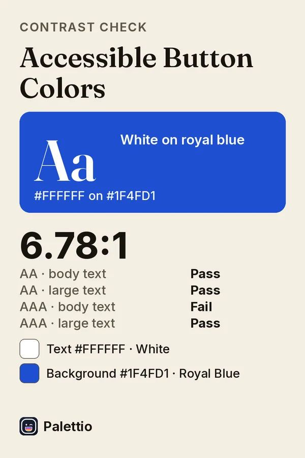
Accessible Button Colors for buttons and links on websites and apps: white #FFFFFF text on royal blue #1F4FD1 has a contrast ratio of 6.78:1, enough for WCAG AA at every text size and AAA for large text. Check any pair in Palettio's contrast checker: AA and AAA results, plus accessible color suggestions.
Aa White on Royal Blue
6.78:1
- AA normalPass
- AA largePass
- AAA normalFail
- AAA largePass
- Text · White
- Background · Royal Blue
Tap a code to copy it.
Make one from your own photo
Palettio pulls the palette out of any photo or screenshot, reads a single color live through the camera, checks contrast, and exports the codes as CSS, JSON and more.